Styles
One palette for every page and diagram here. It changes rarely, so it lives on a page rather than in each file.
Levels
For a status that goes from good to bad. Always a dot and a word, never colour alone.
| Level | Hex | Used for |
|---|---|---|
| OK | #1baf7a | Test data published; an implementation passes |
| Caution | #e0a526 | An implementation is incomplete; test data expires within 90 days |
| Avoid | #d64545 | An implementation fails; test data has expired |
| Unknown | #9aa5b1 | Planned: no test data yet |
Series
One colour per item, in this order, for lines and marks that are told apart rather than ranked. Chosen to stay apart for colour-blind readers.
#2a78d6
#eb6834
#1baf7a
#eda100
#e87ba4
#8a63d2
Diagrams
A diagram goes on a page only where it explains something words don’t. Every diagram is a hand-written SVG in assets/diagrams/, with the same parts and colours, and its own light and dark versions through prefers-color-scheme.
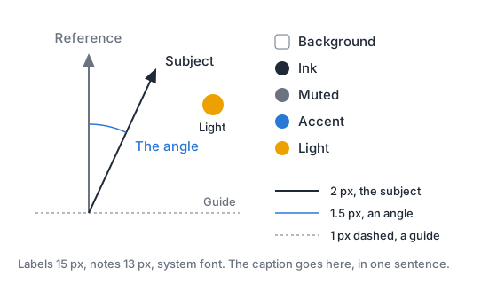
The sample above shows each role in use; the table gives its colours.
| Role | Light · dark | Used for |
|---|---|---|
| Background | #ffffff · #161b22 | A card with 12 px corners |
| Ink | #1f2937 · #e5e7eb | Labels, and the lines the diagram is about |
| Muted | #6b7280 · #9aa5b1 | References like true north, guides, scales and the caption |
| Accent | #2a78d6 · #6aa7ee | The one quantity the diagram explains, and its label |
| Light | #eda100 | The sun, and the lit part of the moon |
- Type: the system font. Labels at 15 px, notes and the caption at 13 px.
- Lines: 2 px for the subject, 1.5 px for arcs that mark an angle, 1 px dashed (3 on, 3 off) for guides.
- Caption: one sentence in muted type along the bottom, saying how to read it or what’s exaggerated.
- Examples say so. A made-up angle or value is labelled an example, and drawn to scale where it can be.
- Alt text says what the diagram shows in a sentence, for readers who can’t see it.
Ink
#0b0b0b rings every dot and swatch, so a colour holds on a light page and a dark one. The site’s icon uses the OK green.